The Process
The Inital Sketches
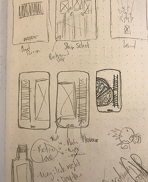
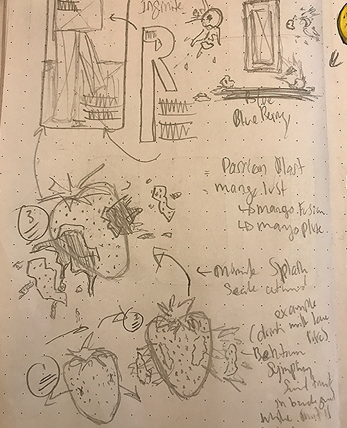
When it came to the initial concept of Retro Ignition, I wanted to create a product that would allow me to have some fun with the creative direction. I decided to go with bottled juice and began sketching out different concepts. I wanted the layout to be fun and playful, which is why I chose to align the main text vertically. That allowed me to have more room to implement a stylish image in the background.
Photoshop & Illustrator
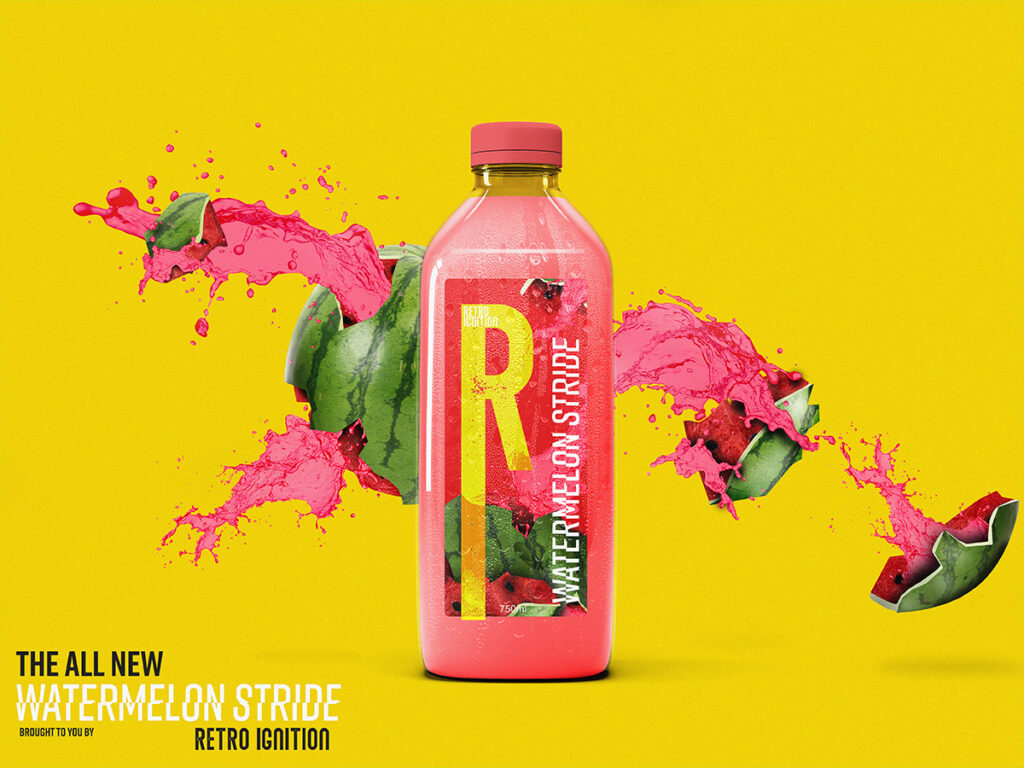
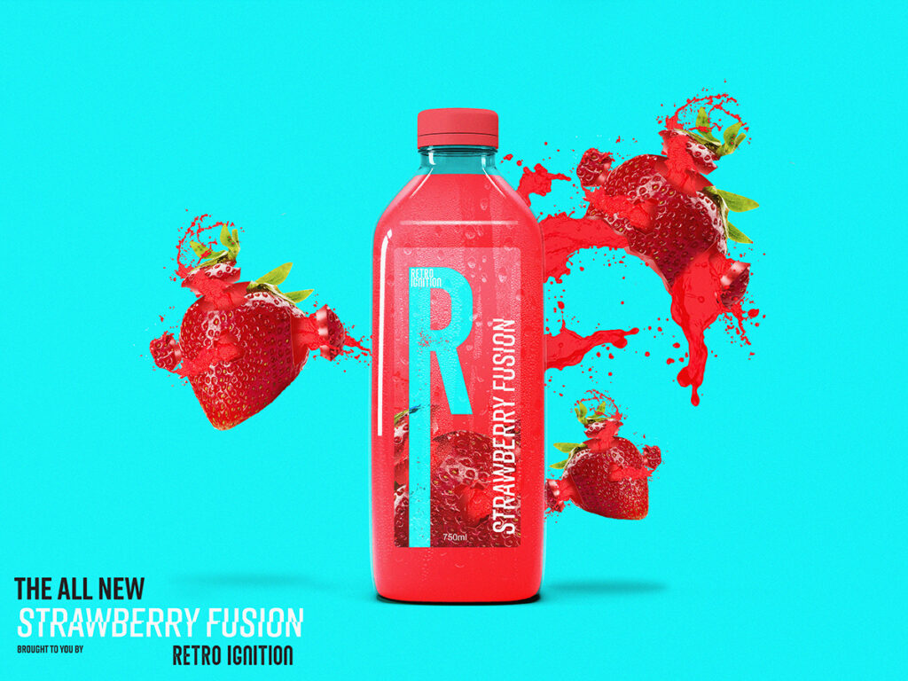
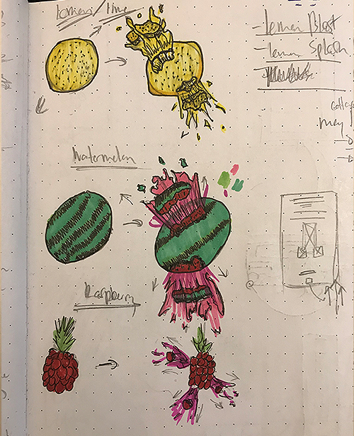
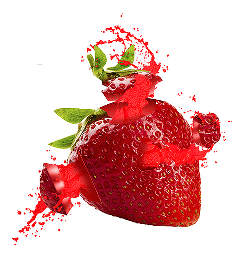
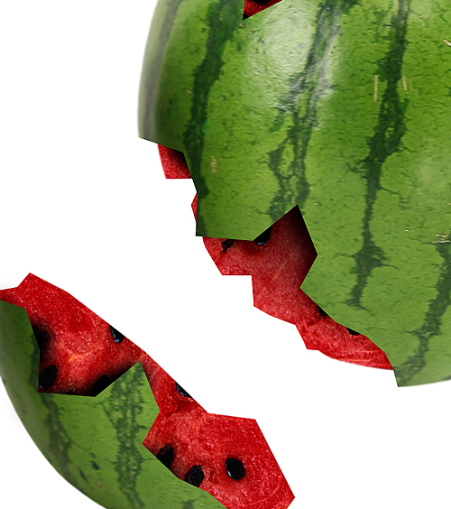
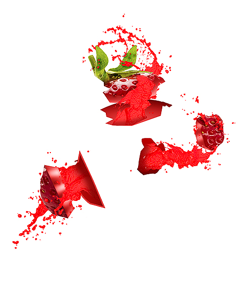
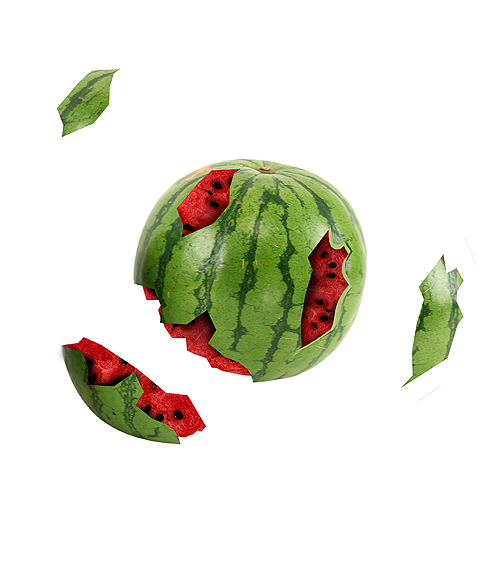
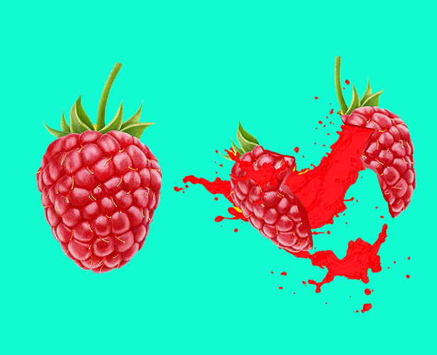
Instead of just throwing in stock images of fruits, I wanted my photo-editing skills to play a significant role in the overall creative process. I wanted something fresh and explosive and came up with just that! Below are a few examples showing off how I went about blowing them up!
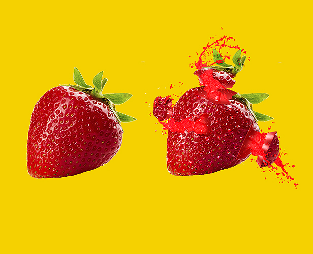
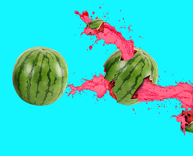
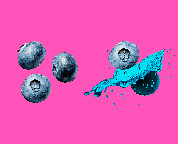
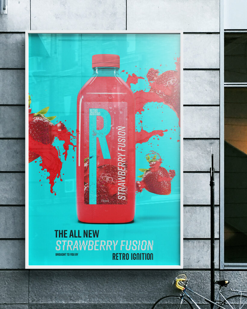
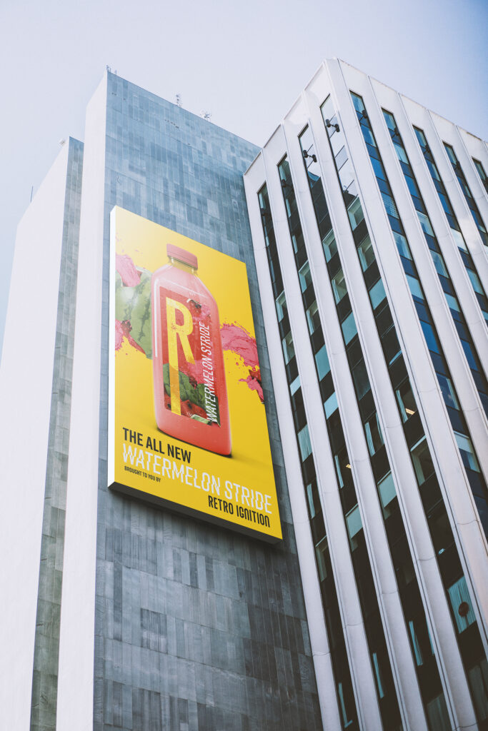
I am extremely happy with how this design project turned out. Not only was I able to have fun challenging myself with various designs and configurations, but I was also once again able to bring an idea to life and apply it across various mediums. With the combination of Photoshop, Illustrator and After Effects I’ve been able to do things I’ve only dreamed of doing. I love being able to share my creative process, from the initial sketches to finally being able to hit play! And at the end of it all being able to look back at all the various pieces that came together to create something magical.
The Final
I found it particularly interesting that while sketching out ideas for several different fruits, Ode to Joy popped up in my head – there’s something about classical music and explosions that go hand and hand. Although I didn’t end up using that particular song for the advert, I did end up using another classic; J.S. Bach: Cello Suite No. 1 in G major, played on piano.
